The ‘Aladdin’ and ‘Star Wars: The Force Awakens’ Posters Are Nearly Identical

Since the new Aladdin trailer premiered along with the film’s new key art, fans have been analyzing everything…. including some uncanny similiarites between the Aladdin poster and 2015’s Star Wars: The Force Awakens poster…
ALADDIN (2019) poster / STAR WARS: THE FORCE AWAKENS (2015) poster pic.twitter.com/IWPCn6NGbD
— Jake Cunningham (@jakehcunningham) March 12, 2019
These posters share a lot of the same elements… and we mean a lot. You can’t deny them – and fans haven’t…
Spooky😂😂#StarWars #Aladdin pic.twitter.com/wsF3UTwJZ1
— Leia Solo (@LeiaSolo67) March 12, 2019
https://twitter.com/JoeRyanMusic1/status/1105546948302553088
https://twitter.com/tarektoverso/status/1105485824995536896
Rather than blame Disney, some fans have actually come to Disney’s defense, claiming that the posters aren’t that similar and that the color schemes are just popular.
Really not that similar. The composition is different, and Star Wars wasn't the first to use the colours red, yellow and blue on a poster.
— SimpleSimon (@simon1972) March 12, 2019
https://twitter.com/sandygrains/status/1105762480939130880
Amidst the Twitter debate that has erupted, one fan posted a video that analyzes movie posters’ design, and why their themes are so similar.
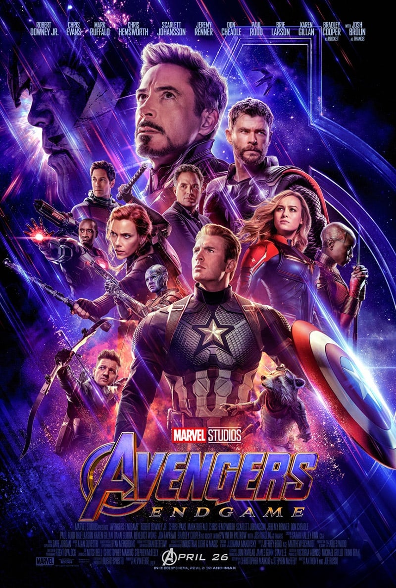
This video walks you through the evolution of movie posters’ design, and how it relates to the film’s genre. We actually appreciate this – as we happen to agree that a lot of films in this space do seem to have movie posters that are all morphing into the same design – we even see it in the new Avengers: Endgame key art which released this week – though it a slightly different color scheme.
Poster design debates aside, we’re incredibly excited for Disney’s live-action Aladdin which hits theaters on May 24, 2019! But in the meantime, if you want to nerd out with us over poster design semantics. We invite you to join the force…. uhh conversation, in the comment area below. 😉
We’d love to hear your thoughts!
Responses